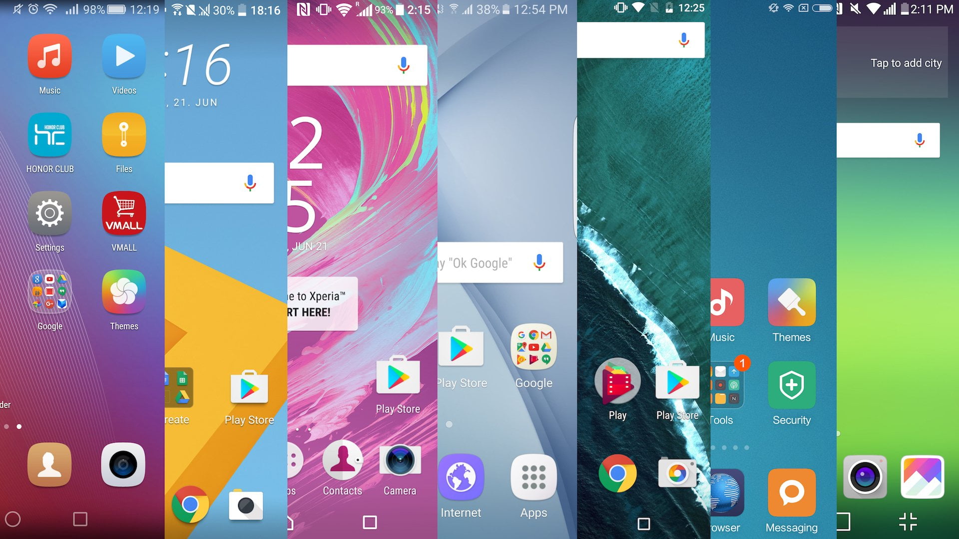
Android is very popular among the people because of its easy use and versatility. It is a mobile operating system (OS) currently developed by Google, based on the Linux kernel.

Android UI Comparison Device and OS List
- Google Nexus 5: Stock Android Android 6.0.1 Marshmallow
- Samsung Galaxy Note 5: TouchWiz Android 6.0.1 Marshmallow
- LG G3: Optimus Android 5.0 Lollipop
- HTC One (M9): Sense 7.0 Android 5.1 Lollipop
- Sony Xperia Z3: Xperia Android 5.1.1 Lollipop
- OnePlus X: OxygenOS 2.1.2 Android 5.1.1 Lollipop
Galaxy Note 5:
The first thing is changed is the home screen. There are not many differences between the different UIs, except that each developer uses its own icons. The Nexus 5 has the distinct Android look, but apart from that, things are pretty similar.
Each has a set app dock with around five buttons, all but Samsung’s feature the App Drawer button in the center.
Nexus 5:
When we look at Nexus 5, things look quite different on the lock screen. Each UI has its own date and time display. You can access the camera from the front screen of all of them except the
HTC One (M9):
HTC’s Sense enables you to access your phone, messaging, the internet, and camera apps straight from the lock screen. And all of them allow lock screen notifications, something that came with the arrival of Android 5.0 Lollipop.
LG G3:
G series of LG is gaining the attention of people as they are launching some exciting models. With the introduction of Lollipop, the notification menu has become more homogenized. They all cascade in a similar fashion and, aside from on TouchWiz, all Quick Settings are hidden, to be displayed only with another drag down.
Xperia Z3:
The home screen and notification menu look quite different if we compare it to the previous models of Xperia. TouchWiz, Optimus, and Sense, all use their own icons, and Optimus, in particular, offers a very select number of settings but essentially they stick pretty close together.
OnePlus X:
Menu settings of OnePlus look different too as compared to previous models. They all start with wireless and network options but their icons and arrangements all differ slightly.
Optimus employs an arrangement of tabs to sort the different settings, but the other all utilize a single scrolling list. OxygenOS opts for a dark theme, in contrast with the rest.
Android 6.0 Marshmallow:
The icons of Android 6.0 Marshmallow are changed, but they all function similarly, scrolling left to right on Lollipop or up and down on Marshmallow. The search options are visible in the top bar on all but the Xperia UI. Optimus, OxygenOS, Sense, and TouchWiz all feature prominent edit buttons.
Android 7.0 Nougat:
The icons have changed in this also. But the features and optimized OS we got from this upgrade. Android N is packed with lots of amazing features and it’s the demand of the users. And why not? The devices are also packed with Android N like One Plus 5, Google Pixel etc.
I have already written Android N review but with custom ROM review. And it’s also the Google’s project called AOSP.
Android 8.0 Oreo:
It is in the beta version available for Google devices. The upcoming features are shown by the beta review of this version. Lately, it will be the best version among all
