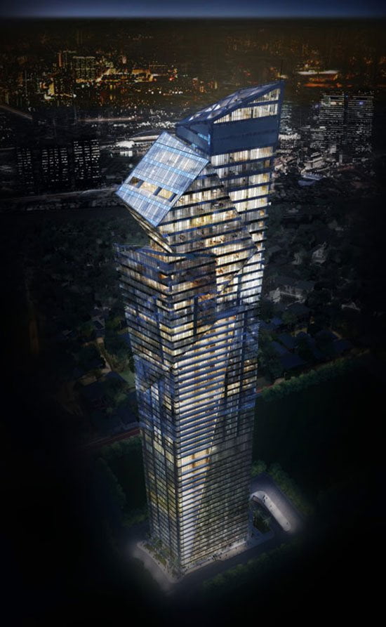
The glazed tower rises dramatically before dividing subtly into three segments that soar to different heights. a fourth volume sits atop the building, providing more floor space for the penthouse below which overlooks manila bay. the semi-reflective envelope comprises angular balconies and terraces that contribute towards the facades rhythmic geometric pattern.
The lower third of the edifice is dedicated to offices, with residential accommodation above featuring penthouses, duplexes, suites and one, two and three bedroom apartments.
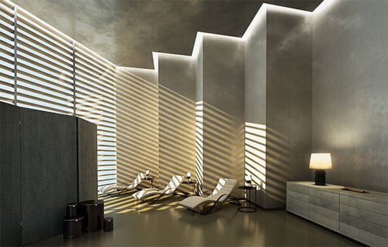
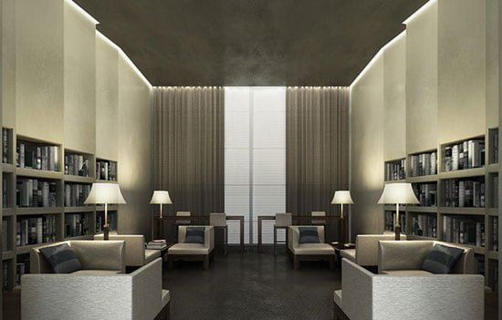
Each unit features floor-to-ceiling glazing with a unique floor plans that offer two floors of amenities for its residents.
The tower’s slender form means that room is provided for a landscaped public plaza at the base of the design, while provision for parking is found below ground.

So, friends this is what architect think and explore in Century Spire by Daniel Libeskind.
Ref : centuryspire, designboom, #image © studio AMD, #studio daniel libeskind, #Century Spire, #Daniel Libeskind.
I hope you people enjoy the Century Spire by Daniel Libeskind go beyond a Tradition in Philippines.
